Principal Components Analysis (PCA)
Principal components analysis (PCA) is one of the most useful techniques to visualise genetic diversity in a dataset. The methodology is not restricted to genetic data, but in general allows breaking down high-dimensional datasets to two or more dimensions for visualisation in a two-dimensional space.
Hint
You can find the solution notebooks for all exercises in this and subsequent sessions here
Genotype Data
This lesson is also our first contact with the genotype data used in this and most of the following lessons. The dataset that we will work with contains 3,902 individuals, each represented by 593,124 single nucleotide polymorphisms (SNPs). Those SNPs have exactly two different alleles, and each individual has one of four possible values at each genotype: homozygous reference, heterozygous, homozygous alternative, or missing. Those four values are encoded 2, 1, 0 and 9 respectively.
The data is laid out as a matrix, with columns indicating individuals, and rows indicating SNPs. The data itself comes in the so-called “EIGENSTRAT” format, which is defined in the Eigensoft package used by many tools used in this workshop. In this format, a genotype dataset consists of three files, usually with the following file endings:
*.snp- The file containing the SNP positions. It consists of six columns: SNP-name, chromosome, genetic positions, physical position, reference allele, alternative allele.
*.ind- The file containing the names of the individuals. It consists of three columns: Individual Name, Sex (encoded as M(ale), F(emale), or U(nknown)), and population name.
*.geno- The file containing the genotype matrix, with individuals laid out from left to right, and SNP positions laid out from top to bottom.
Exercise
Explore the three files used in the workshop. They are located unser ~/share/genotype_data. You can use the bash terminal, and use less -S <FILENAME> to view each file and skim through it to get a feeling for the data. Alternatively, you can create use a Bash notebook, use cd as above, and then use the unix tools head in combination with cut to show portions of the files (see solutions notebook bash_commands).
Exercise
Confirm that there are 1,351 individuals in the dataset. (Advanced) Count how many different populations there are. Hint: You can use the Unix tools awk '{print $3}', sort and uniq -c to achieve that (see solutions notebook bash_commands).
How PCA works
To understand how PCA works, consider a single individual and its representation by its 593,124 markers. Formally, each individual is a point in a 593,124-dimensional space, where each dimension can take only the three possible genotypes indicated above, or have missing data. To visualise this high-dimensional dataset, we would like to project it down to two dimensions. But as there are many ways to project the shadow of a three-dimensional object on a two dimensional plane, there are many (and even more) ways to project a 593,124-dimensional cloud of points to two dimensions. What PCA does is figuring out the “best” way to do this project in order to visualise the major components of variance in the data.
Preparing the parameter file
For actually running the analysis, we use a software called smartPCA from the Eigensoft package. As many other tools from this and related packages, smartPCA reads in a parameter file which specifies its input and output files and options. The basic format of the parameter file with one extra option (lsqproject) looks like this:
genotypename: <GENOTYPE_DATA>.geno
snpname: <GENOTYPE_DATA>.snp
indivname: <GENOTYPE_DATA>.ind
evecoutname: <OUT_FILE>.evec
evaloutname: <OUT_FILE>.eval
poplistname: <POPULATION_LIST_FILE>.txt
lsqproject: YES
numoutevec: 4
numthreads: 1
Here, the first three parameters specify the input genotype files, as discussed above. The next two rows specify two output file names, typically with ending *.evec and *.eval. The parameter line beginning with poplistname contains a file with a list of populations used for calculating the principal components (see below). The option lsqproject is important for applications including ancient DNA with lots of missing data, which I will not elaborate on. For the purpose of this workshop, you should use lsqproject: YES. The last option numoutevec specifies the number of principal components that we compute.
Population lists vs. Projection
The parameter named poplistname is a very crucial one. It specifies the populations whose individuals are used to calculate the principal components. Why not just all of them you ask? For two reasons: First, there are simply too many of them. As you may have found out in the exercise above there are more than 500 ancient and modern populations available in the dataset, and we don’t want to use all of them, since the computation would take too long. More importantly, however, we generally try to avoid using ancient samples to compute principal components, to avoid specific ancient-DNA related artefacts affecting the computation.
So what happens to individuals that are not in populations listed in the population list? Well, fortunately, they are not just ignored, but “projected”. This means that after the principal components have been computed, all individuals (not just the one in the list) are projected onto these principal components. That way, we can visualise ancient populations in the context of modern genetic variation. While that may sound a bit problematic at first (surely there must be variation in ancient populations that is not represented well by modern populations), but it turns out to be nevertheless one of the most useful tools for this purpose. The advantage of avoiding ancient-DNA artefacts and batch effects to affect the visualisation outweighs the disadvantage of missing some private genetic variation components in the ancient populations themselves. Of course, that argument breaks down once the analysed populations become too ancient and detached from modern genetic variation. But for our purposes it will work just fine.
For this workshop, I prepared two population lists:
/home/training/share/WestEurasia.poplist.txt
/home/training/share/AllEurasia.poplist.txt
As you can tell from the names of the files, they specify two sets of modern populations representing West Eurasia or all of Europe and Asia, respectively.
Exercise
Look through both of the population lists and google any population name that you don’t recognise to get a feeling for the ethnic groups represented here.
Running smartPCA
Now go ahead and prepare a parameter file according to the layout described above…
Hint
Put all filenames with their absolute path into the parameter file. To prepare the parameter file, you can use the so-called “Heredoc” syntax in bash, if you are familiar with it (as done in the solution notebook bash_commands). Alternatively, you can use the Jupyter file editor to create the parameter file.
… and run smartPCA using the command smartpca -p <PARAMS_FILE>
Exercise
Run smartpca with the prepared parameter file.
Note
Running smartPCA with this dataset takes between 15 and 30 minutes.
Hint
smartpca outputs a flurry of log messages that may be useful later. If you run the program within a Jupyter Notebook, you can always go back later and view the log, as it is saved within the notebook. If you choose to run it through a terminal, you should direct the output into a file, e.g. like this smartpca -p PARAMS_FILE > output.log.
To facilitate further processing, I have put the results file into ~/share/pca_results/pca.WestEurasia.* and ~/share/pca_results/pca.AllEurasia.*
Plotting modern populations
There are several ways to make nice publication-quality plots (Excel is usually not one of them). Popular tools include R and matplotlib . Both frameworks can be used within the Jupyter Notebook Python3 interface, and here I opted for matplotlib.
I suggest that you start a new Jupyter Notebook with the Python3 language, and load a couple of essential libraries in the first code cell:
%matplotlib inline
import pandas as pd
import matplotlib.pyplot as plt
Let’s have a look at the main results file from smartpca, the *.evec file, for example by going to the terminal and running head EVEC_FILE, where EVEC_FILE should obviously replaced with the actual filename of the PCA run. You should find something like:
#eigvals:     6.289     3.095     2.693     2.010
     I001    -0.0192      0.0353     -0.0024     -0.0084     Ignore_Iran_Zoroastrian(PCA_outlier)
     I002    -0.0237      0.0372     -0.0018     -0.0133     Ignore_Iran_Zoroastrian(PCA_outlier)
IREJ-T006    -0.0226      0.0417      0.0045      0.0003     Iran_Non-Zoroastrian_Fars
IREJ-T009    -0.0214      0.0404      0.0024     -0.0064     Iran_Non-Zoroastrian_Fars
IREJ-T022    -0.0165      0.0376     -0.0003     -0.0106     Iran_Non-Zoroastrian_Fars
IREJ-T023    -0.0226      0.0376     -0.0031     -0.0101     Iran_Non-Zoroastrian_Fars
IREJ-T026    -0.0203      0.0373     -0.0009     -0.0103     Iran_Non-Zoroastrian_Fars
IREJ-T027    -0.0241      0.0392      0.0025     -0.0072     Iran_Non-Zoroastrian_Fars
The first row contains the eigenvalues for the first 4 principal components (PCs), and all further rows contain the PC coordinates for each individual. The first column contains the name of each individual, the last row the population. To load this dataset with python, we use the pandas package, which facilitates working with data in python. To load data using pandas, use the read_csv() function.
Exercise
Load one of the two PCA results files with ending *.evec. You need to skip the first row and name the columns manually. Use “Name”, “PC1”, … “PC4”, “Population” for the column names. Google documentation for read_csv() to ensure that tabs and spaces are considered field delimiters, that the first row is skipped, and that the column names are correctly entered. Please see the 02_pca_python solution notebook if you need help. You should now have the pca data loaded into a dataframe.
You should now have a pandas dataframe which looks like this:
Name    PC1    PC2     PC3     PC4     Population
        I001    -0.0192      0.0353     -0.0024     -0.0084     Ignore_Iran_Zoroastrian(PCA_outlier)
        I002    -0.0237      0.0372     -0.0018     -0.0133     Ignore_Iran_Zoroastrian(PCA_outlier)
   IREJ-T006    -0.0226      0.0417      0.0045      0.0003     Iran_Non-Zoroastrian_Fars
   IREJ-T009    -0.0214      0.0404      0.0024     -0.0064     Iran_Non-Zoroastrian_Fars
   IREJ-T022    -0.0165      0.0376     -0.0003     -0.0106     Iran_Non-Zoroastrian_Fars
   IREJ-T023    -0.0226      0.0376     -0.0031     -0.0101     Iran_Non-Zoroastrian_Fars
   IREJ-T026    -0.0203      0.0373     -0.0009     -0.0103     Iran_Non-Zoroastrian_Fars
   IREJ-T027    -0.0241      0.0392      0.0025     -0.0072     Iran_Non-Zoroastrian_Fars
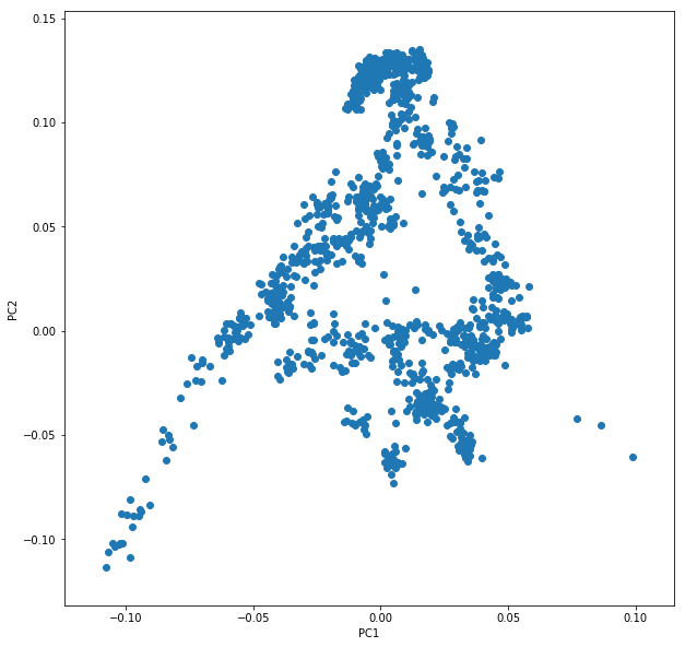
Let’s say you called this dataframe pcaDat. You can now very easily produce a plot of PC1 vs. PC2 for all samples , by running plt.scatter(x=pcaDat["PC1"], y=pcaDat["PC2"]), which in my case yields a boring figure like this:
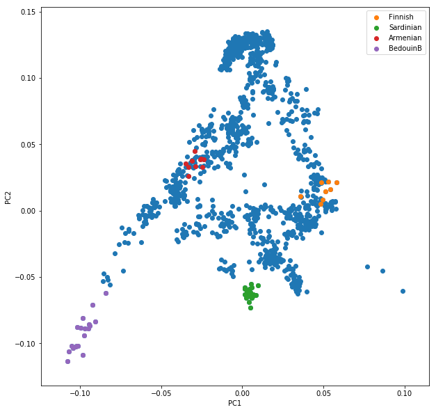
Now, obviously, we would like to highlight the different populations by color. A quick and dirty solution is to simply plot a different subset of the data on top, like this:
plt.scatter(x=pcaDat["PC1"], y=pcaDat["PC2"], label="")
for pop in ["Finnish", "Sardinian", "Armenian", "BedouinB"]:
    d = pcaDat[pcaDat["Population"] == pop]
    plt.scatter(x=d["PC1"], y=d["PC2"], label=pop)
plt.legend()
This sequence of commands gives us:
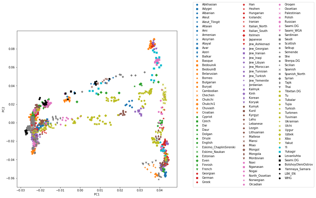
OK, but how do we systematically show all the populations? There are too many of those to separate them all by different colors, or by different symbols, so we need to combine colours and symbols and use all the combinations of them to show all the populations. To do that, we first need to load the population list that we want to focus on for now, which are the same lists as used above for running the PCA. In case of the West Eurasian PCA, you can load the file using pd.read_csv("~/share/WestEurasia.poplist.txt", names=["Population"]).sort_values(by="Population"). Next, we need to associate a color number and a symbol number with each population. To keep things simple, I would recommend to simply cycle through all combinations automatically. This code snippet looks a bit magic, but it does the job:
nPops = len(popListDat)
nCols = 8
nSymbols = int(nPops / nCols)
colorIndices = [int(i / nSymbols) for i in range(nPops)]
symbolIndices = [i % nSymbols for i in range(nPops)]
popListDat = popListDat.assign(colorIndex=colorIndices, symbolIndex=symbolIndices)
You should check that this worked by viewing the resulting popListDat variable (just type its name into a new Jupyter notebook cell). Now we can produce the full PCA plot, which uses a for loop to cycle through all populations in the popListDat dataframe, and plots each listed population in turn, with its assigned color and symbol. To prepare, we need a list of colors and symbols. Here, I am using the default color sequence from matplotlib and a manual sequence of symbols, which for the sake of simplicity I simply put here for you to copy-paste:
symbolVec = ["8", "s", "p", "P", "*", "h", "H", "+", "x", "X", "D", "d", "<", ">", "^", "v"]
colorVec = [u'#1f77b4', u'#ff7f0e', u'#2ca02c', u'#d62728', u'#9467bd',
            u'#8c564b', u'#e377c2', u'#7f7f7f', u'#bcbd22', u'#17becf']
With this, the final plot command is:
for i, row in popListDat.iterrows():
    d = pcaDat[pcaDat.Population == row["Population"]]
    plt.scatter(x=-d["PC1"], y=d["PC2"], c=colorVec[row["colorIndex"]],
                marker=symbolVec[row["symbolIndex"]], label=row["Population"])
plt.legend(loc=(1.1, 0), ncol=3)
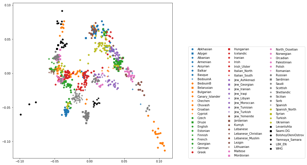
which produces a nice plot like this (note that I’ve flipped the x axis to make the correlation with Geography more apparent):
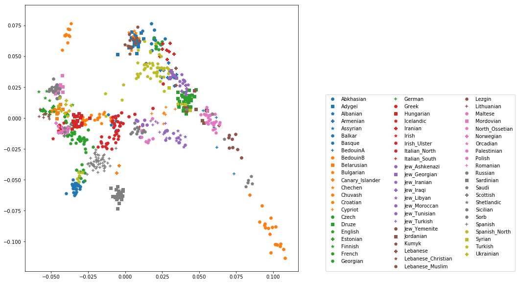
Adding ancient individuals
Of course, until now we haven’t yet included any of the actual ancient test individuals that we want to analyse, but with plot command above you can very easily add them, by simply adding a few manual plot command before the legend, but outside of the foor loop.
Exercise
Add two ancient populations to this plot, named “Levanluhta”, “JK2065” (the third individual from Levanluhta with different ancestry) and “BolshoyOleniOstrov”, using the same technique of selecting populations from the big dataset and plotting them as used in case of the modern populations. Use “black” as colour, and different symbols for each additional population. While you’re at it, go ahead and also add the population called “Saami.DG”.
Finally, we are going to learn something about deeper European history, by also adding some Neolithic and Mesolithic populations:
Exercise
Add three more populations to the plot, called “WHG” (short for Western Hunter-Gatherers), “LBK_EN” (short for Linearbandkeramik Early Neolithic, from about 6,000 years ago), and “Yamnaya_Samara”, a late Neolithic population from the Russian Steppe, about 4,800 years ago. It can be shown that modern European genetic diversity is formed by a mixture of these three divergence ancient groups (Lazaridis2014, Haak2015).
The final plot should look like this:
You can carry out similar commands to plot the All Eurasia case, which should look like this: